Version 1 design system
A navy welcome beside a family photograph, alternating program stories, and strong green, blue, and sand sections. Versions 1 and 2 share content and geometry; their ground colors and corner radii differ.
DRAFT — NOT APPROVED · Documented from the current /v1/ implementation.
Open Version 1 siteThe homepage opening
A solid navy copy panel sits beside the family photograph. White copy and a marigold “home.” lead to a white counseling action and phone alternative. A linked history strip follows; four photo-led pathways alternate image and text.
We help you
get home.
One conversation is where it starts.
Free housing guidance. Affordable home options for rural families and farmworkers.
Talk to a housing counselorOr call (863) 385-2519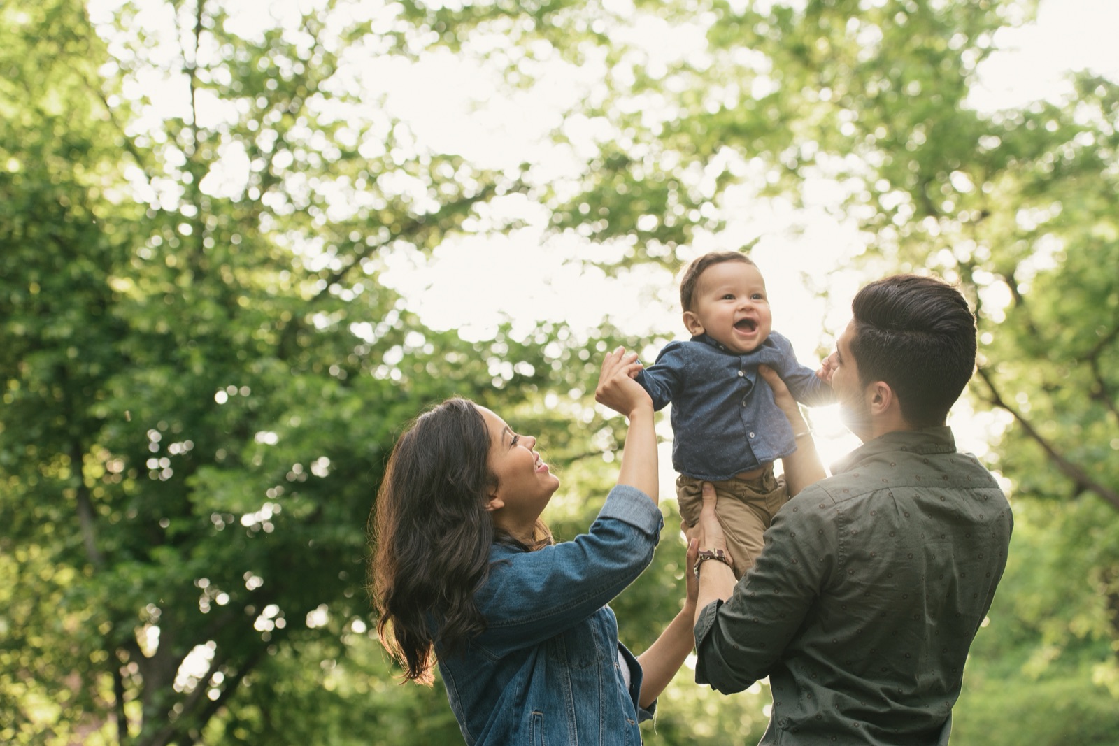
Color in use
Navy carries the welcome, workshop, and partnership sections. Live oak carries the three-step guide; sand frames Azalea and news; sky wash sits behind partner logos. V1 uses sand-wash ground and 16px corners; V2 uses white ground and 4px corners. Swatches read the shared live tokens.
Navy
#0E2E78Headings, navigation, primary action
Royal
#1A4FC9Shared blue structure and focus
Sky tint
#DCE6FBInstitutional support surfaces
Sky wash
#EFF4FDQuiet blue surfaces
Live oak
#1E5C3FResident actions and next-step band
Field green
#2F9E63Large resident emphasis
Green tint
#E4F2EAResident reassurance
Meadow mist
#F3F8F5Light resident surface
Sand
#EADFC8Azalea and news panels
Cream
#FBF8F0Public reading ground
Sand wash
#FDFBF6Content section ground
Marigold
#F2A33CDonate and homepage word emphasis
Ink #1B2333 is the body color; slate #5A6275 supports secondary copy. Field green is reserved for large emphasis, never normal-size white text. Marigold is used for Donate and the homepage “home.” emphasis; it is not a warning state.
Two voices, one hierarchy
Libre Franklin 600/700 carries headings. Outfit 400/600 carries body copy, navigation, labels, and actions. Both are self-hosted.
We help you get home.
Libre Franklin · 700 · homepage heading: 40–76px, line-height 1.04, tracking −0.025em
Clear guidance, at a human scale.
Libre Franklin · 600 · source section headings: 20px
One conversation is where it starts. Let’s help you figure out what’s possible.
Outfit · 400 · readable paragraph copy
Homepage body is 17px at 1.6 line height; the lead is 20px. Supporting welcome copy caps at 36ch. Section headings are 32–48px; the alternating pathway headings are 24–36px.
Shared navigation
The sticky two-row header places Contact and language in the phone utility row. The compact lockup, grouped photographic menus, and Donate sit below. Over the navy partnership section, the header turns navy with white controls. A cream four-column footer groups contact, housing help, FNPH links, and farmworker support.

Component specimen: the live lockup and Donate action. This compact demonstration shows their relationship; the site’s complete menu includes its responsive disclosure behavior.
Signature components
A white rectangular counseling action offers the opening next step. The sunburst is reserved for Donate. The divider reuses the identity’s eight hard-edged color bands.
Donate states
Default, focus, and current-page treatment; every specimen opens the owned donation page.
Identity divider
Navy, two sky bands, marigold, royal, two field bands, and live oak. Decorative, never a status indicator.
Program and form patterns
Program links pair a specific action with orientation. Forms use explicit labels, visible errors, and a named next step; farmworker entry remains callback-first.
Layout & interaction rules
The shared system sets the rhythm; V1 and V2 keep the same reading order and geometry.
- Frame
- 78rem desktop frame, expanding to 86rem at 90rem viewports and 94rem at 110rem. Shared gutters align navigation and content.
- Spacing
- 4, 8, 16, 24, 32, 48, and 72px. Generous section spacing separates program decisions; compact spacing keeps a label with its action.
- Shape
- 52px-minimum ordinary actions with 4px corners. V1 uses 16px panels; V2 uses 4px. The split photograph takes the same version-specific outer corners.
- Responsive
- At 40rem, welcome, pathway, step, rental, and proof columns stack. Alternating image order resets to image before copy. Navigation collapses at 64rem; the footer changes from four columns to two.
- Keyboard & motion
- Visible keyboard focus and descriptive link labels. Donate’s 36-second sunburst rotation, arrow movement, and compression stop under reduced-motion preferences.
See the current Version 1 application guide
Implementation sources: SharedHome.astro · home-shared.css · home-chrome.css · HomeChromeBehavior.astro · HomeFooter.astro. Shared palette and fonts: theme-overrides.css. Read the brand foundation.