Version 6.1
Design system
Cinematic concept stills replace the painted scene. Cream panels join each film frame to its caption; Navy closes the page.
Current implementation · Draft, not approved
Open Version 6.1 siteColor in use
Cream caption fields and Navy type make photographic frames readable. The film-paper variable currently falls back to #FAF6E8; the hero applies a dark veil over its image.
#FAF6E8#0E2E78#FFFFFF#EFF4FD#C8CDD0#081218The shared Donate action retains marigold. View foundation colors.
Typography & measure
Libre Franklin carries headings; Outfit carries prose and controls. The primary heading weight is 600.
Display specimen · Libre Franklin 600
Reading specimen · Outfit 400
- Display range
- 54–88px hero on desktop, 52px on mobile; service captions use 32–46px headings.
- Content frame
- 1180px maximum content width, with fluid 20–64px side gutters.
- Body rhythm
- Service prose uses 20px / 1.6 in V6; V6.1 captions use 18px / 1.55. Small-screen text steps down to 17–18px.
Film-image program choices
Each 16:9 image sits above its program copy in a white card, with a ruled action at the bottom. The group rests on a cream field.
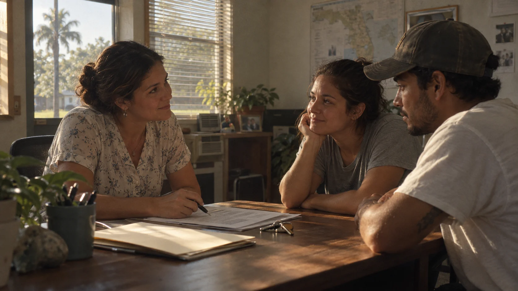
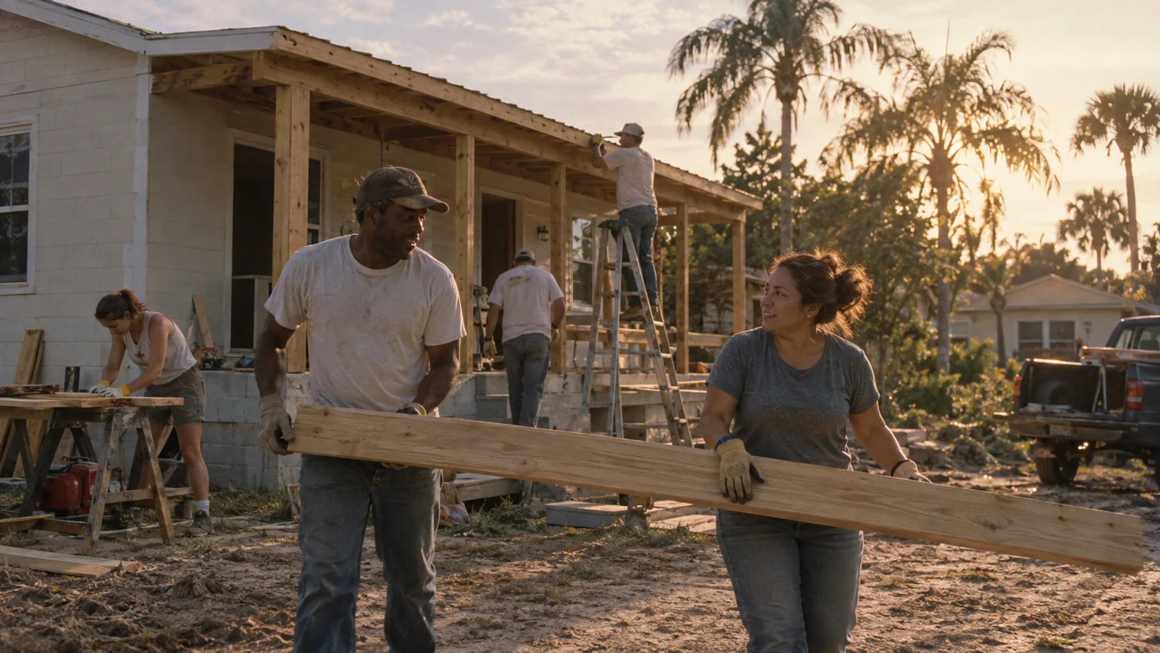
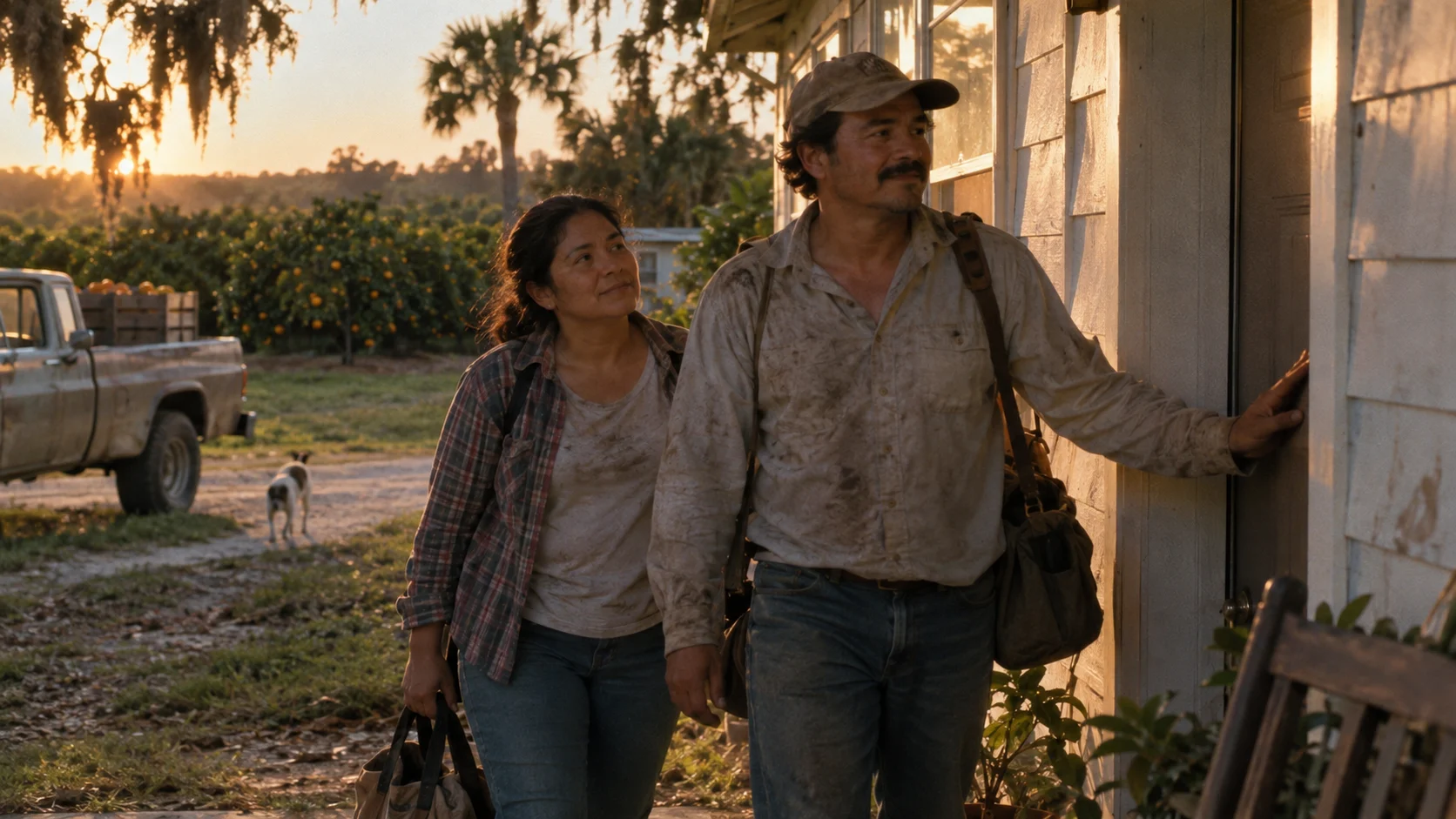
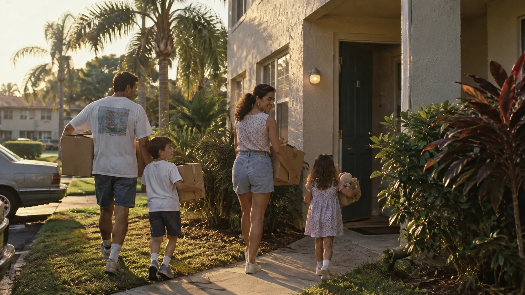
Current artwork and labels; a compact specimen of the implemented composition. Generated scenes illustrate housing pathways.
Navigation, interiors & interaction
- Navigation
- The V6 and V6.1 homepages use V4Layout’s compact navigation branch rather than V4’s grouped utility treatment. Their interiors now use V3ArtLayout and its shared editorial navigation. Dedicated Spanish and Haitian Creole routes preserve each version prefix.
- Interior pages
- Contact, team, board, and story routes now have dedicated entries using shared editorial components. Remaining routes use the shared catch-all. V6 inherits the V3 editorial world; V6.1 adds cinematic artwork substitution through V61EditorialImage and a focused skip-link correction. Generated scenes are labeled as concepts; archive photography and named portraits are preserved.
- Focus & hover
- Links use a 3px current-color focus outline with 6px offset. Program actions underline; film images brighten slightly on hover.
- Motion & reflow
- Staged service panels are enabled only at 1100px width and 850px height with motion allowed. Other viewports present ordinary stacked image-and-caption spreads. Reduced motion removes scene transitions.
Current implementation sources
Reviewed from the current source on September 11, 2026. This records implementation, not identity approval.
src/pages/v6.1/index.astrosrc/styles/v6-home.csssrc/styles/v61-film.csssrc/layouts/V4Layout.astrosrc/layouts/V3ArtLayout.astrosrc/pages/v6.1/contact/index.astrosrc/pages/v6.1/stories/index.astrosrc/components/v61/V61EditorialImage.astrosrc/styles/v61-interiors.csssrc/data/site-versions.ts